Tenet Advisors
- Naming
- Design
- Brand Strategy
- Visual Identity
- Website Design
A strategic and financial resources firm that needed a new brand build, Tenet was an exciting opportunity for our team. Unlike other wealth management companies, Tenet stood out by diverging from more traditional branding. They needed to support their growing footprint and also represent their confident and candid personality. Their verbal and visual ID was bold and modern, ready to upset the market with a fresh approach.
We were eager to help this brand stake its claim in the Savannah stratosphere.

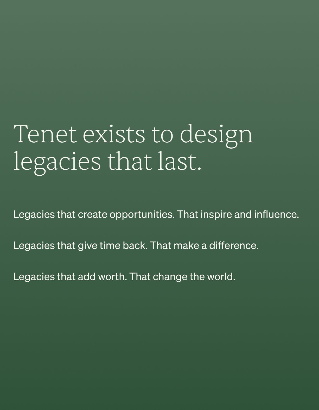
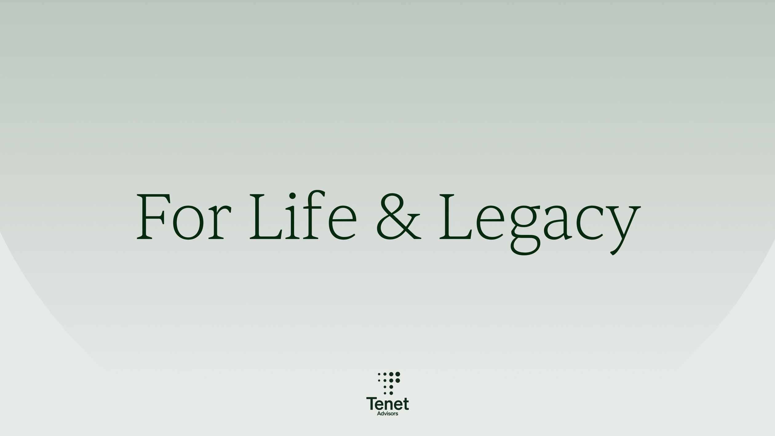
Tenet is passionate about putting its customers first. We partnered with the Tenet team to identify their brand attributes as trustworthy, impactful, and wise. Although being a subject matter expert is a must in wealth management, we focused on the people side of things to avoid coming off as insincere. Helping families thrive was the outcome of that focus, a result of Tenet’s core desire — to design legacies that last.
Besides brand attributes, it was clear that Tenet was built on a foundation of both practicality and expertise — the kind of balance that created strong client relationships and measurable results. That amount of knowledge was so apparent, and we wanted to showcase it in the new brand identity.


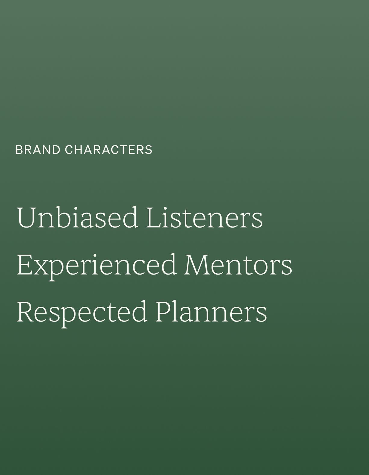
As a strategic and financial resources firm, Tenet empowers the driven to lead exceptional lives and leave extraordinary legacies. A verbal identity that resonated with potential clients was a must. We highlighted personality traits that spoke to the core of the Tenet brand: unbiased listeners, experienced mentors, and respected planners. Their tone of voice was confident and candid, humble and unassuming, unpretentious and relatable.
With Tenet, we dug deep into etymology. We coined The Tenet Principle, literally meaning “the true thing”. This Tenet truth carried through the entire identity process.
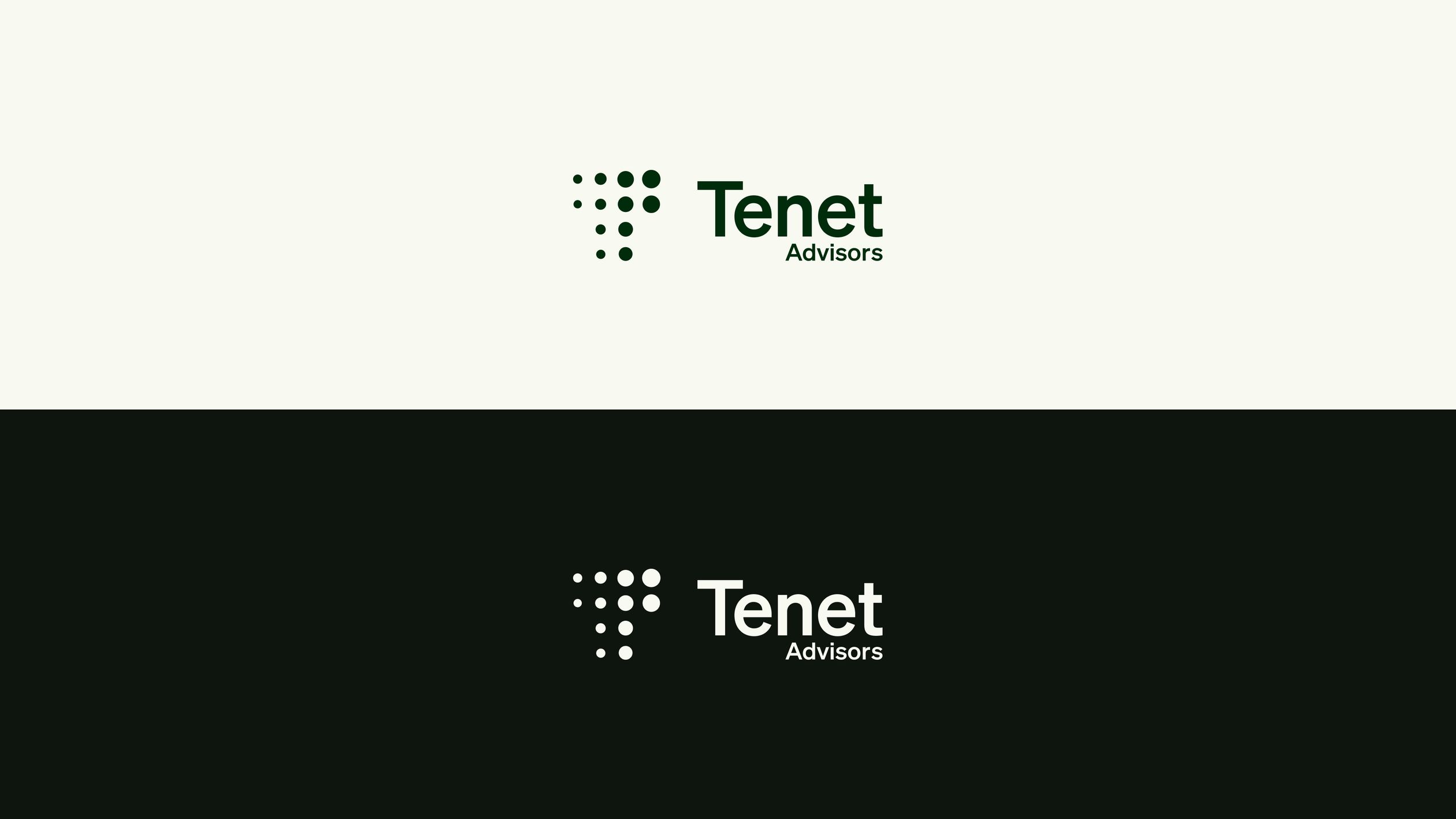
The name “Tenet” is from as early as 15c., and is Latin for "he holds”. In the figurative sense, Tenet means to "hold in mind, take in, understand.” It perfectly represented Tenet’s core principles behind wealth management and the care they take to get to know and understand every client.


The Tenet Principle also inspired the mark, a progressive series of dots following the name’s history. These dots mesh into a “T”. The logo is simple and works across all mediums, but is memorable enough to stay sticky, an effective identifier for the brand.


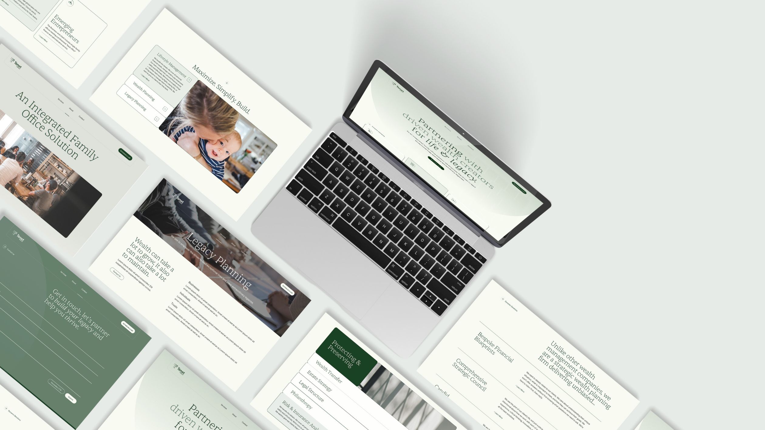
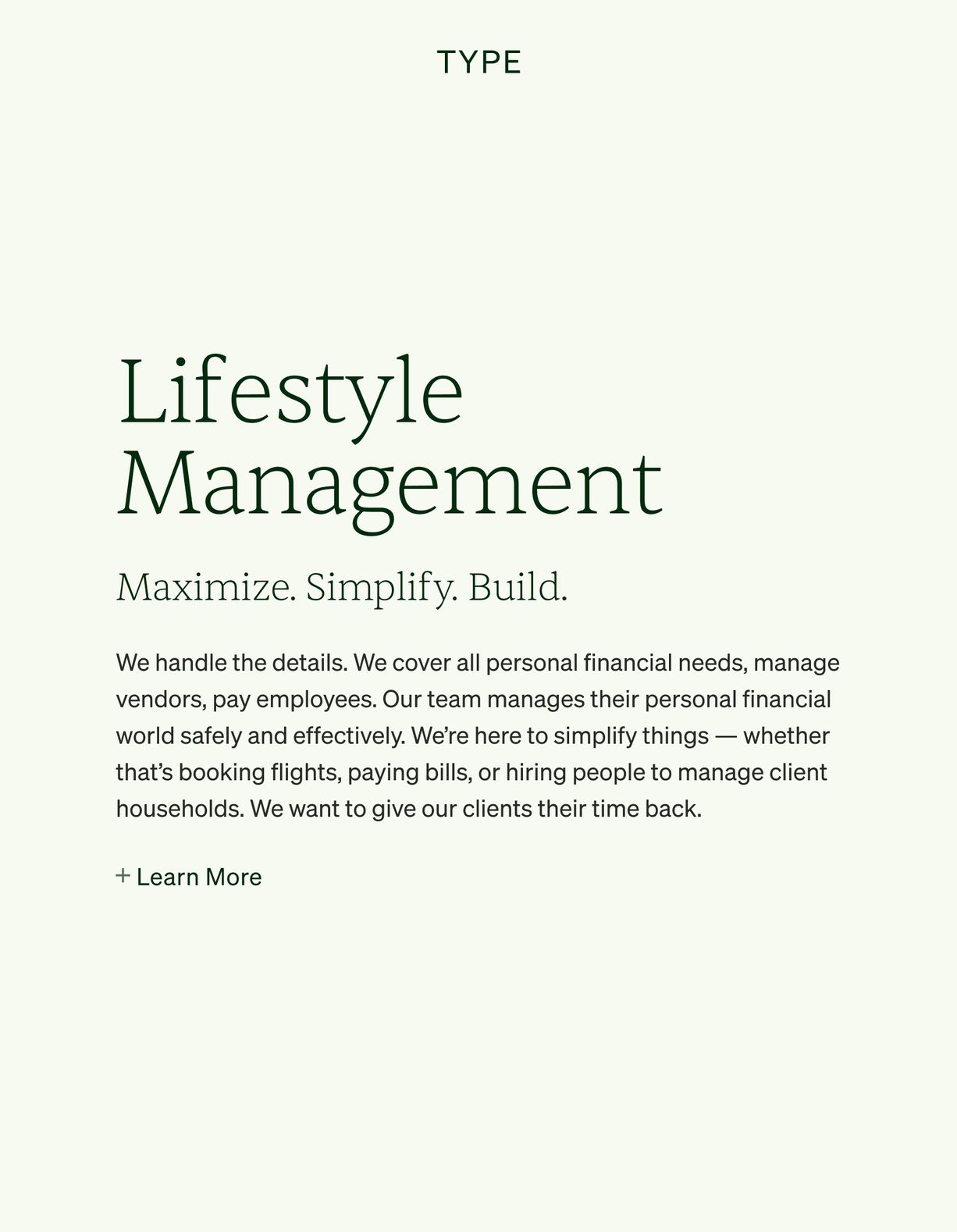
We took a sleek modern approach to digital identity. Tenet's site design highlights easy access and their candid approach to wealth management. The treatment was similar to how we wanted the visual representation to be unique in the market. Personable, yet refined and established. Color and type were selected to stand out from the sea of blacks and blues.